


There’s a great bit in Julian Stallabrass’s Contemporary Art: A Very Short Introduction where he writes:
Art may be imagined as consumerism’s dreaming, playfully recombining the elements of mass culture in promiscuous assemblages, and along the way happening upon items of use.
This passage leapt out at me because, for the past fortnight, one of my photos has been featured on a poster site as part of a project called Urban Coincidence, now in its second iteration.
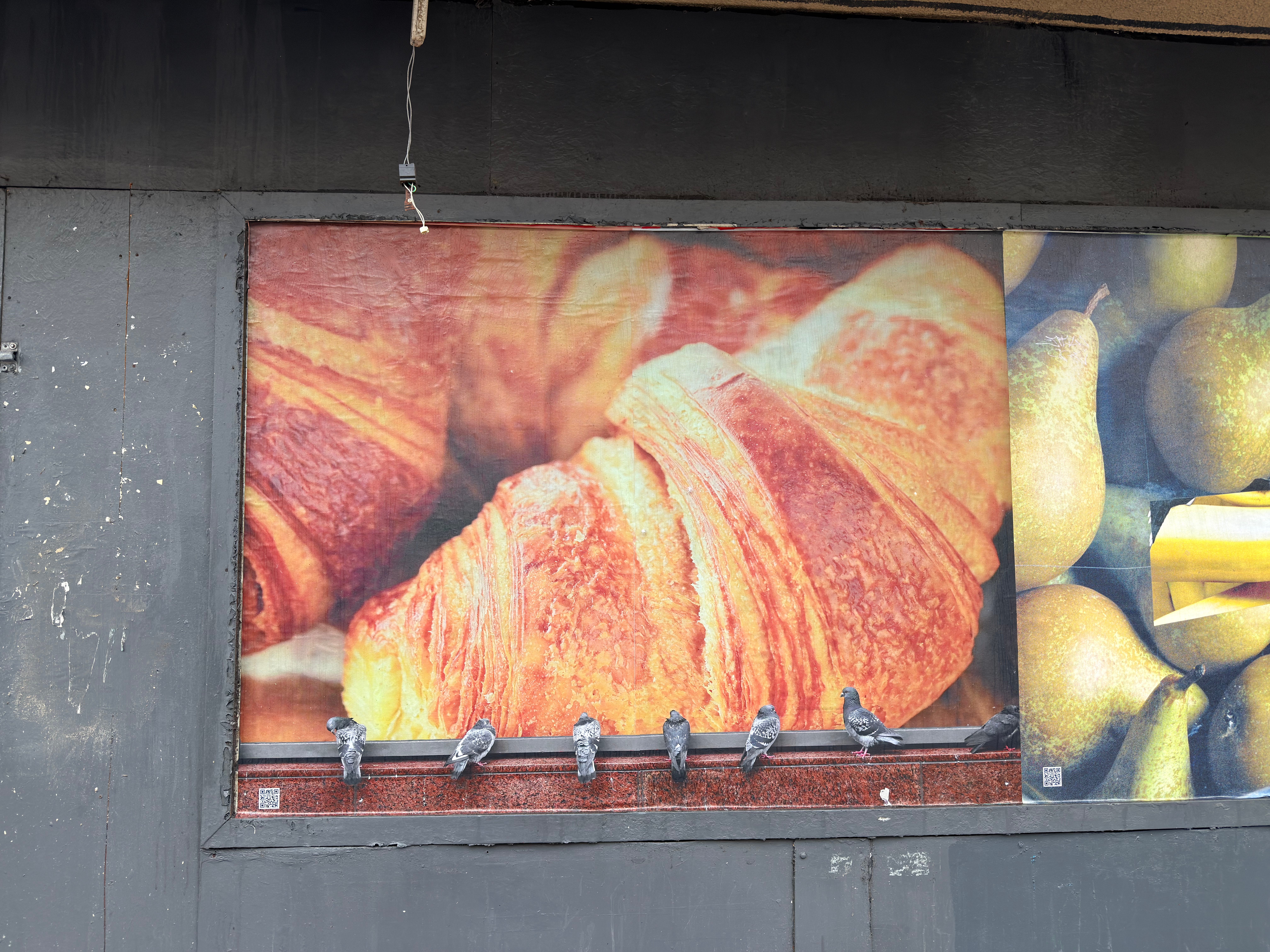
It’s an image of pigeons drawn to a photo of a giant croissant, and it can be found in Glasgow’s Southside. To paraphrase Zhuangzi, is it an advert dreaming it is art or art dreaming it is an advert?
The Urban Coincidence project was initiated in 2024 by three MFA students at Glasgow School of Art: Douglas Rogerson, Sophie Stewart, and Sophia Archontis. On the website, they say they want photographs that:
capture something unusual, out of place, serendipitous, or thought-provoking hidden within the everyday [...] photography can amplify both the sensitivities and mundanity of daily life as well as disrupt the inundation of commercial advertisements by offering moments of reflection
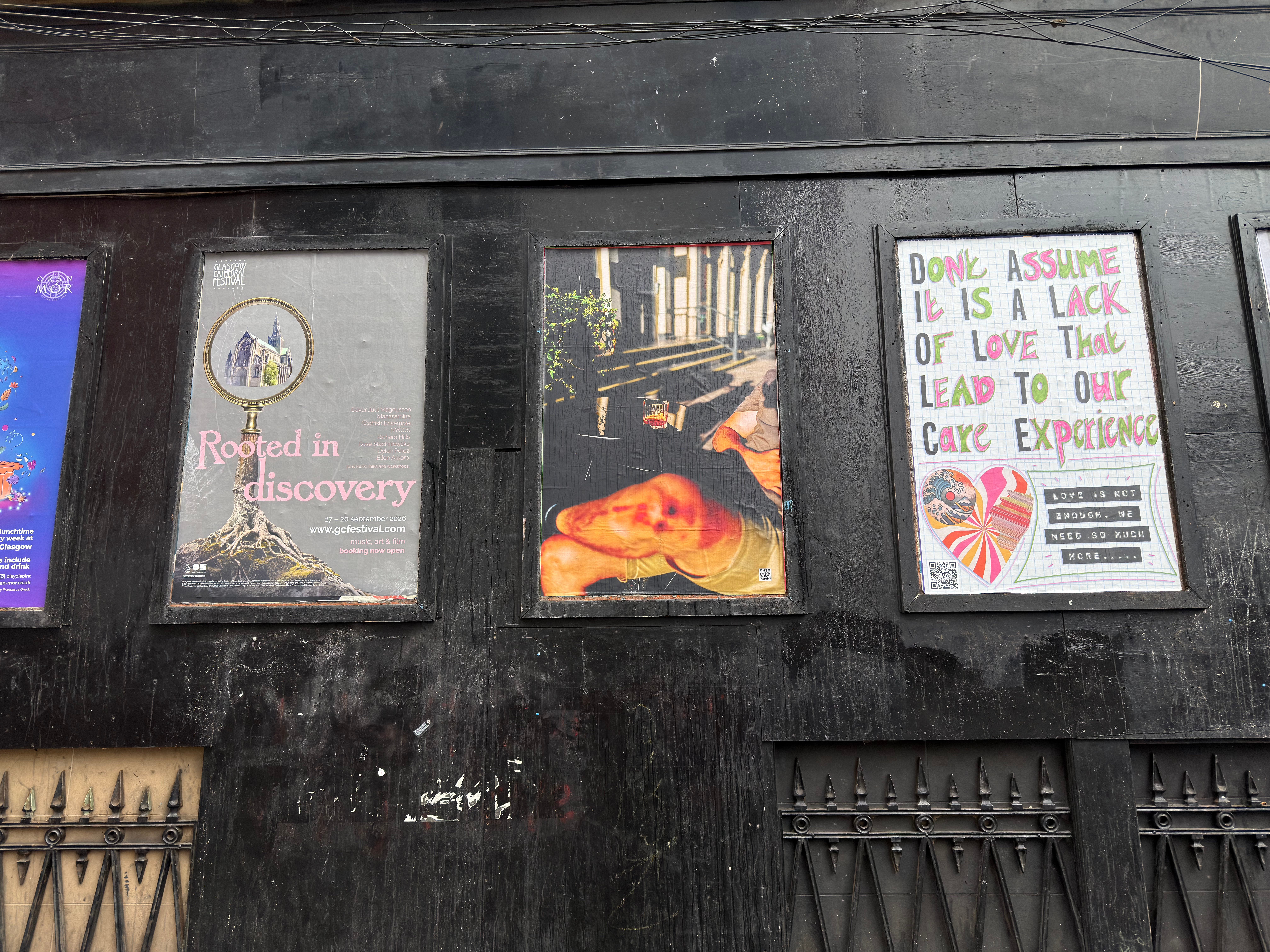
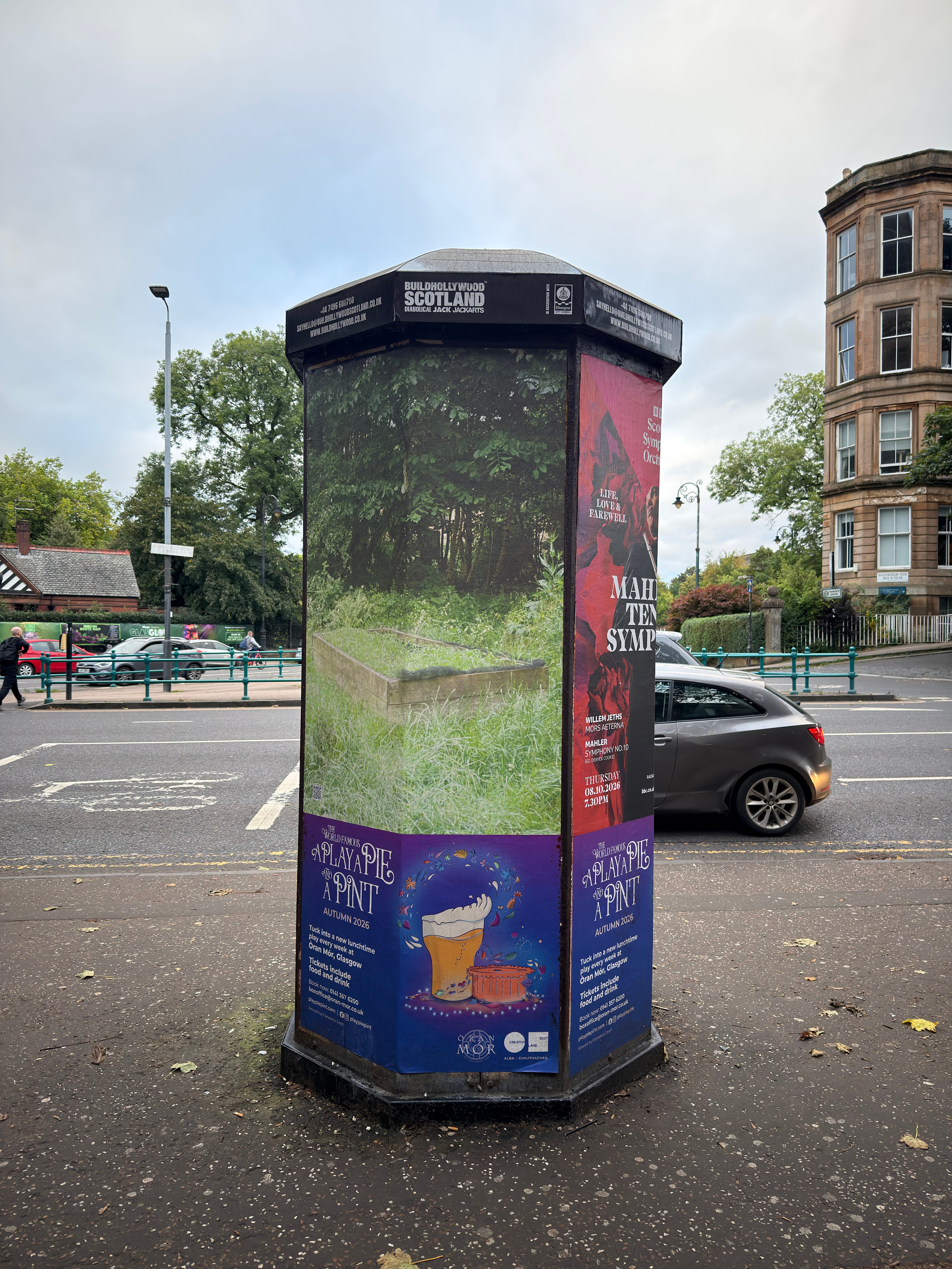
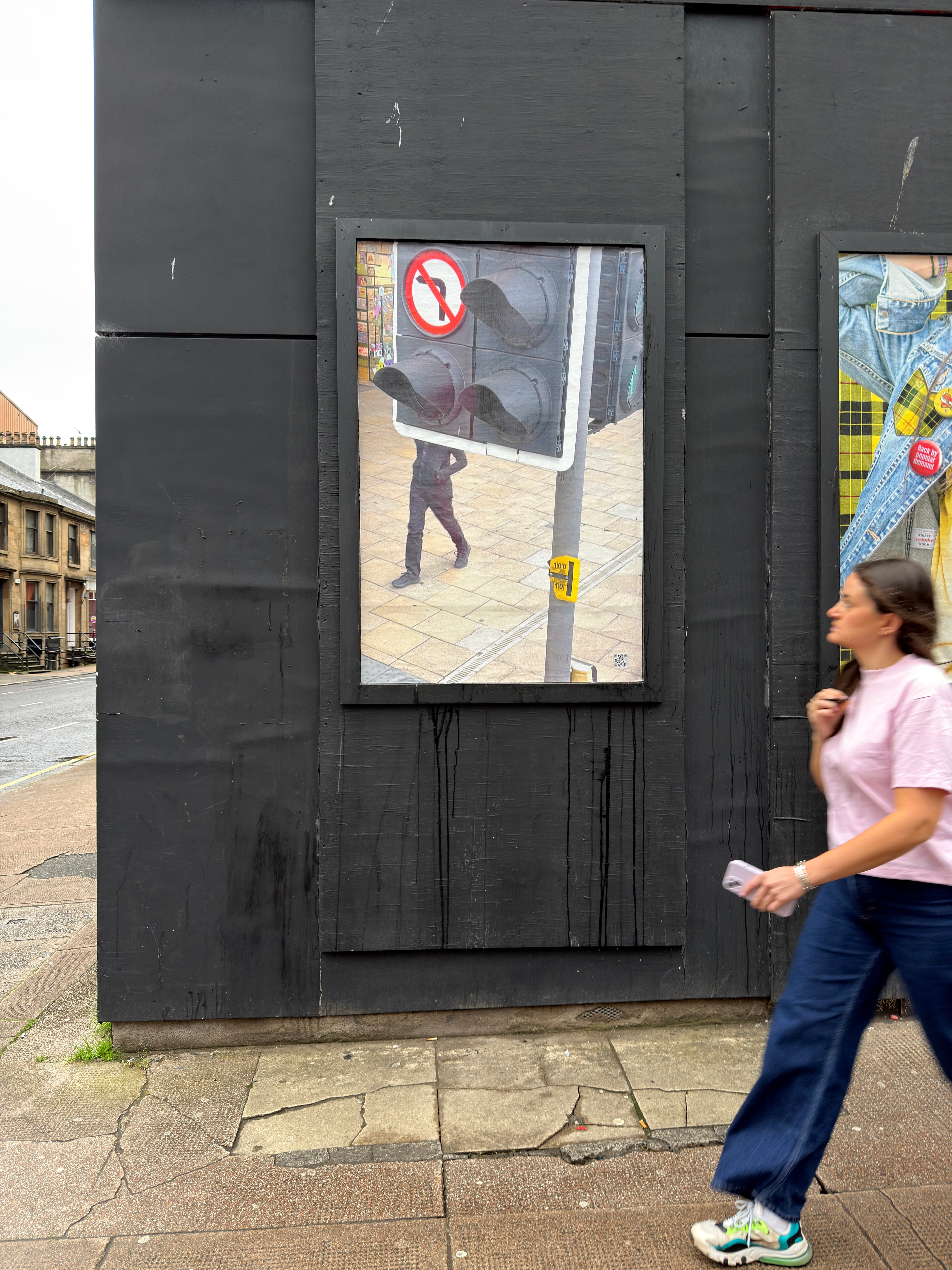
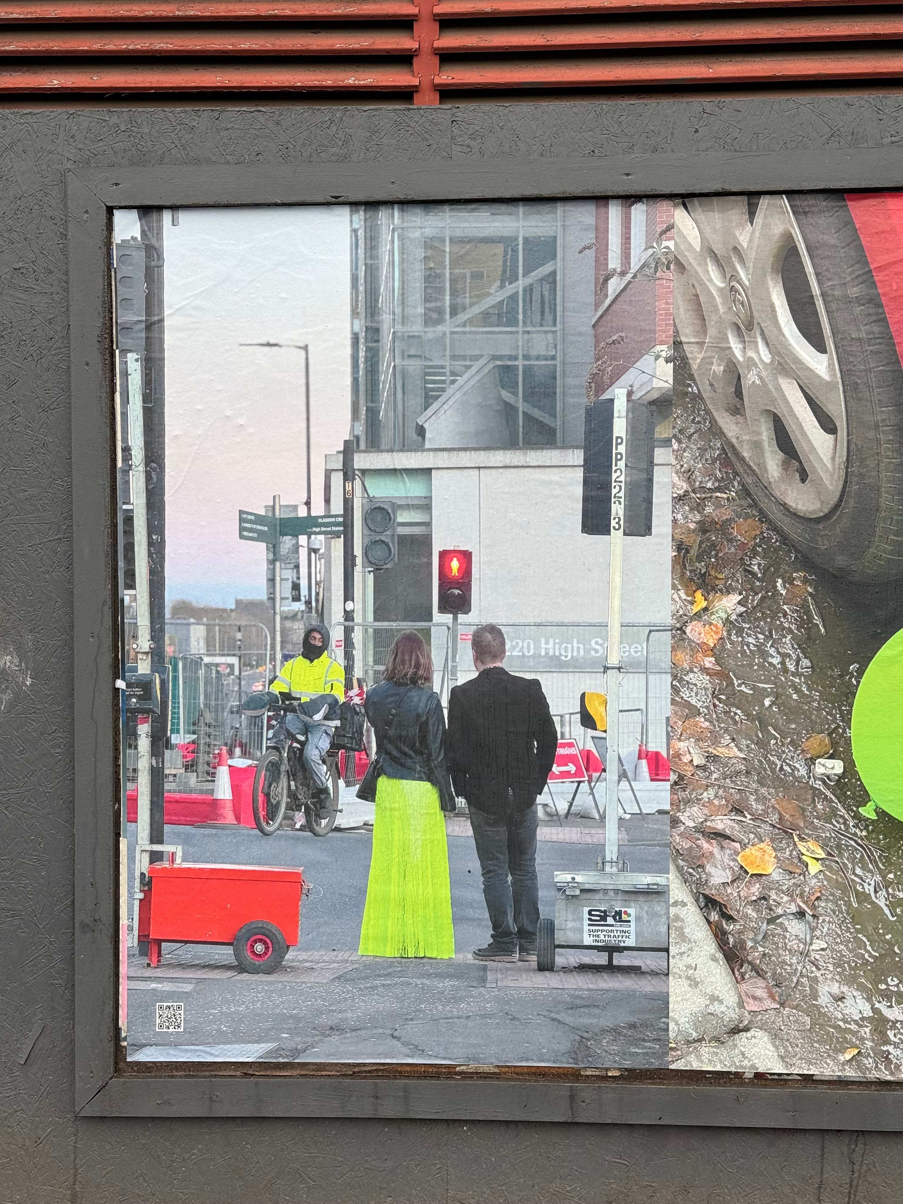
Having visited all the places, I can confirm that once you are attuned to noticing the posters, they are often jarring, especially when placed alongside adverts for musicals. The photographs have a Martian quality that heightens the strangeness of the mundane.
A cynic might say that the sites’ owners, BUILDHOLLYWOOD, rather than being patrons of the arts, are simply raising the cultural status of poster advertising. But it’s difficult to be too cynical when seeing my photograph printed so massively and dropped into the city.
Photography is unusually well suited to being reproduced in poster form. The high street is not a white cube gallery, and the power of the photograph—which emerges from the era of mechanical reproduction—doesn’t rely on the aura of the unique object. The fabric of everyday life becomes part of the work. Everything from parking meters to pedestrians inhabits the same universe.
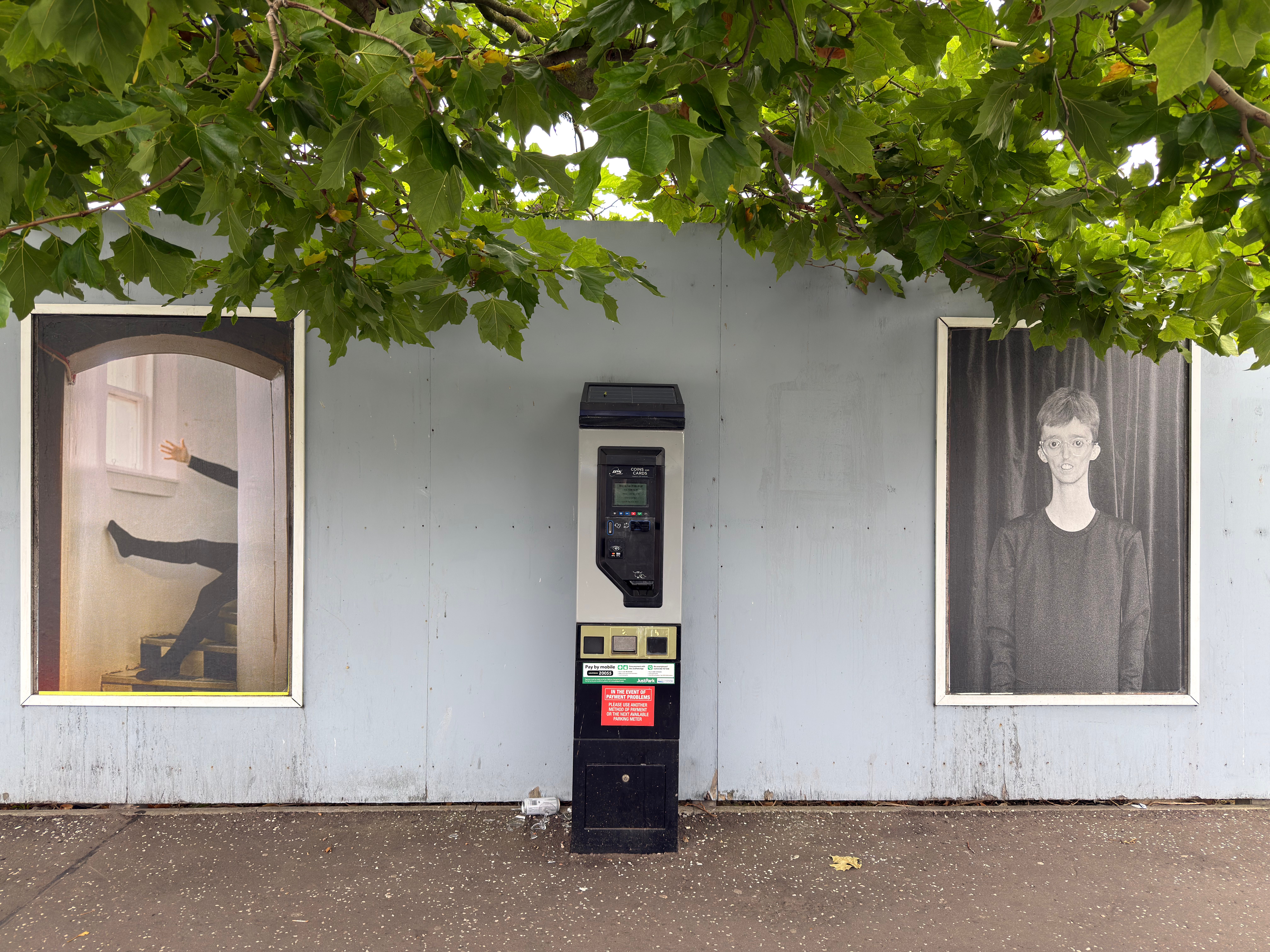
Flannery O’Kafka’s collaboration with Indepen-dance was displayed outside in Dundee recently. For me, this line of posters felt more vital than most of the art in the nearby McManus Museum. The McManus is a traditional, stuffy Victorian art gallery, full of gilded frames and picturesque landscapes. By contrast, O’Kafka’s work was astonishingly immediate.
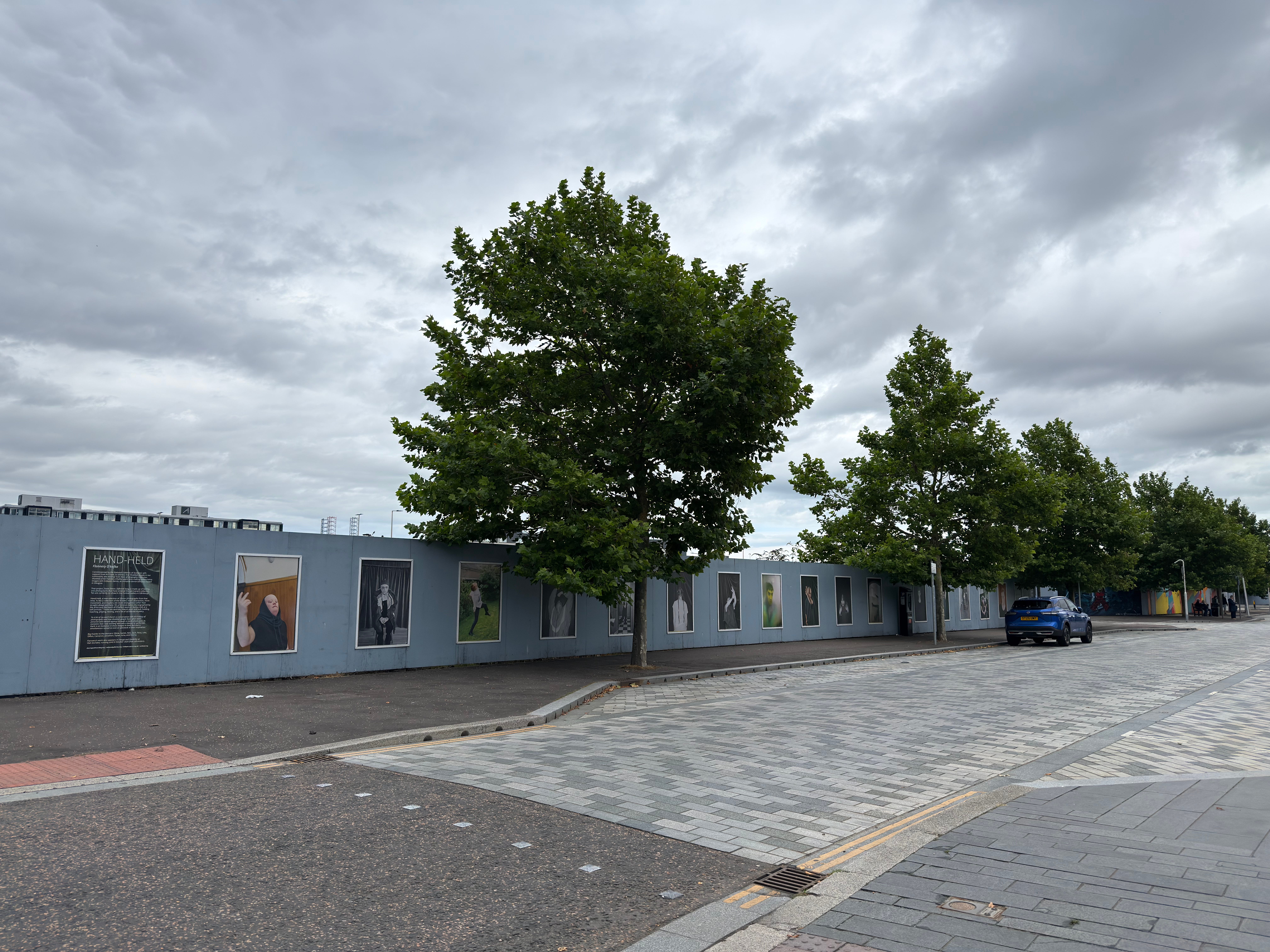
On Instagram, she wrote: “My favourite way to show work—outside, pasted up.” When I asked them about this, they clarified: “For me, it’s partly about the photograph becoming part of the material of what it’s pasted on.”
Likewise, what felt like an occasionally claustrophobically intimate exhibition by Lisette May Monroe in Gulabi Gallery became a riot of punk-pink colour on the streets.
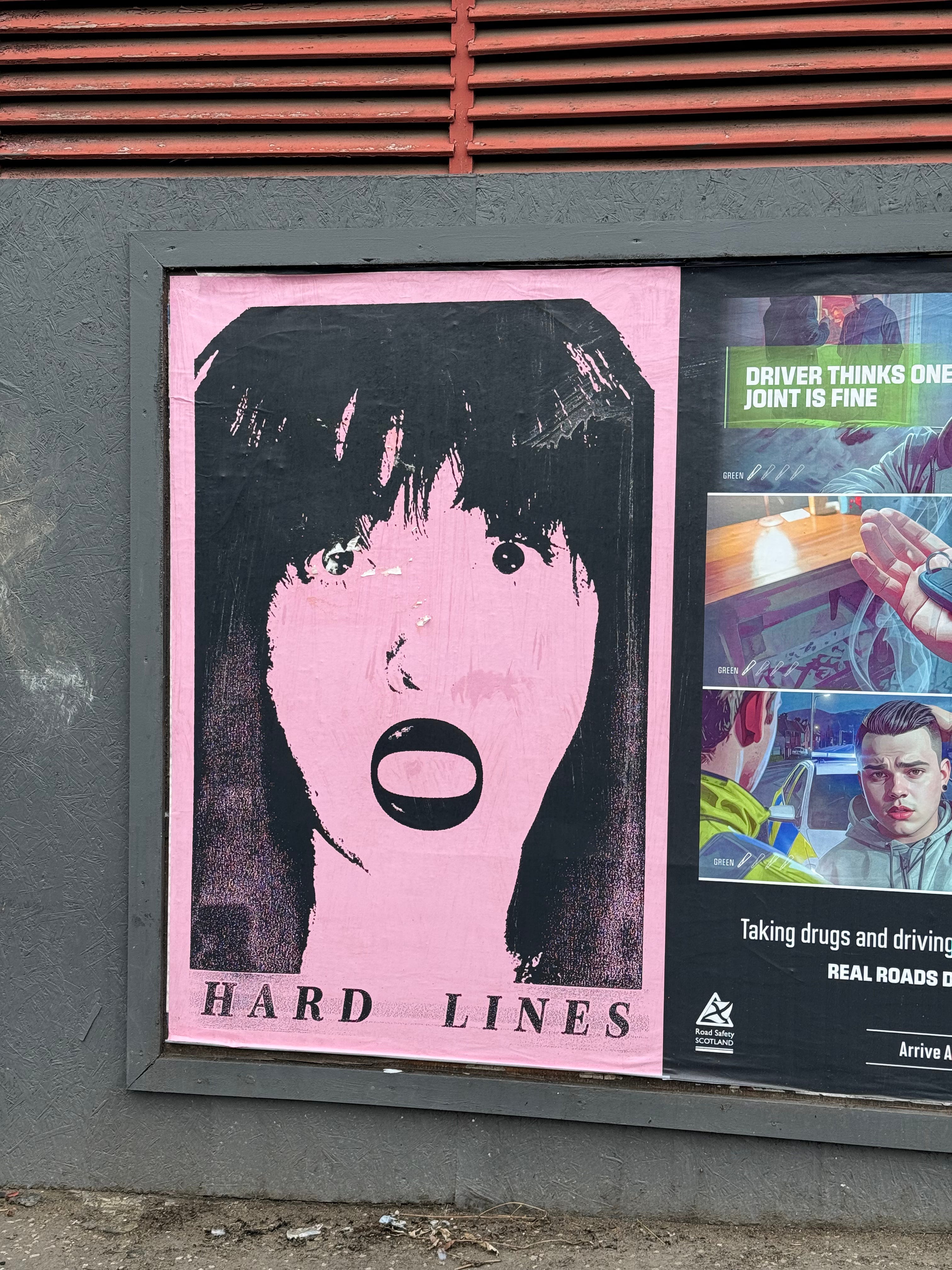
While fly-posters are generally ephemeral, pasted over with the next advert, they can sometimes have an unexpected half-life. Friend of The Crop, Matthew Rich, has been screenprinting posters for decades. When he lived in Manchester in the 1980s, he would print and fly-poster for Factory Records, amongst others. To prove that he hadn’t just thrown them in a skip, he took a photo of the wall, which has become a vivid archive of the era.

Of course, I am aware of the irony that my photo appropriates an advert that already exists. Like the pigeons, we are often seduced by images of the things we desire. Urban Coincidence helps jolt the viewer into a brief moment of lucidity.
The Urban Coincidence photos are scattered over the city. Visiting them was a good excuse to cycle and get in my daily exercise. Here is a selection:


Interview with the artists Douglas Rogerson, Sophie Stewart, and Sophia Archontis
Neil Scott: What led you to do Urban Coincidence?
Douglas Rogerson: All three of us had a habit of collecting lots of images of everyday moments that caught our eye. We wanted to share what’s happening around us just as it is, out in the world where it is already occurring, and to invite others to share their own.
Sophie Stewart: Our individual practices look at interruption and unrest within the urban setting, so it made sense for us to come together and create a project like this.
NS: What are your criteria for selecting images?
SS: I want something that makes me question if I’m seeing the image correctly the first time. Something humorous or quietly intimate. Or even something that’s like “what the fuck”. The images should also reflect the environment they’re placed within.
DR: It’s difficult to pin down. I tend to gravitate to more industrial subjects that can be seen as poetic. Sophie is drawn to the derelict, irreverent, and uncanny. Sophia brings a cheeky, playful, and humorous dimension. We always have such a great pool to choose from, and it’s hard to leave so many stunners out.
NS: How does this poster project relate to your art background?
SS: My practice explores notions of the “contemporary condition”—the human condition head-butting against modern living circumstances. I’m specifically interested in modern working conditions and concepts of happiness, success, and desire. Focusing on urban coincidences is a good way to break up the daily commute and try to see the world past pointed advertising and unattainable goals forced upon you by the attention economy.
DR: I have an affinity for what I affectionately refer to as “discards and disregards”—things used until they are no longer working, needed, or wanted and then left behind. I’m often thinking in terms of function, utility, and supposed purpose alongside personal experience and disillusionment. I really enjoy seeing how others notice the world, themselves within it or outside of it, and how everyday moments can capture what one feels without much, if any, added intervention.
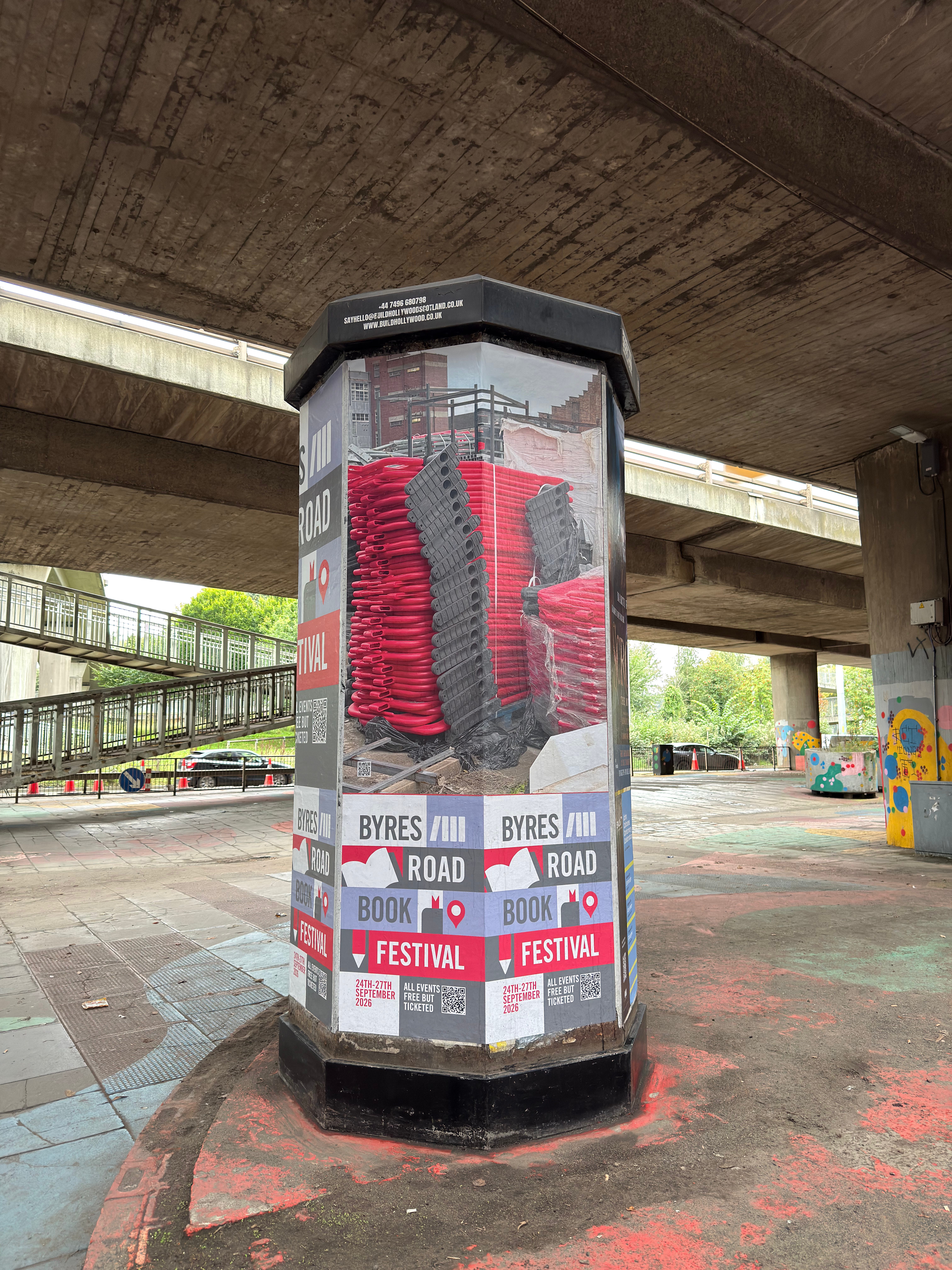
Sophia Archontis: I’ve always had a community-engaged practice. I used to run a regular supper club for creatives called Opn Tble and have been focusing on showcasing emerging sound and music artists through a regular event called Electronic Experimentations. I move fluidly between art, photography, poetry, sound, and music spaces, which I think all express peculiarities within the everyday.
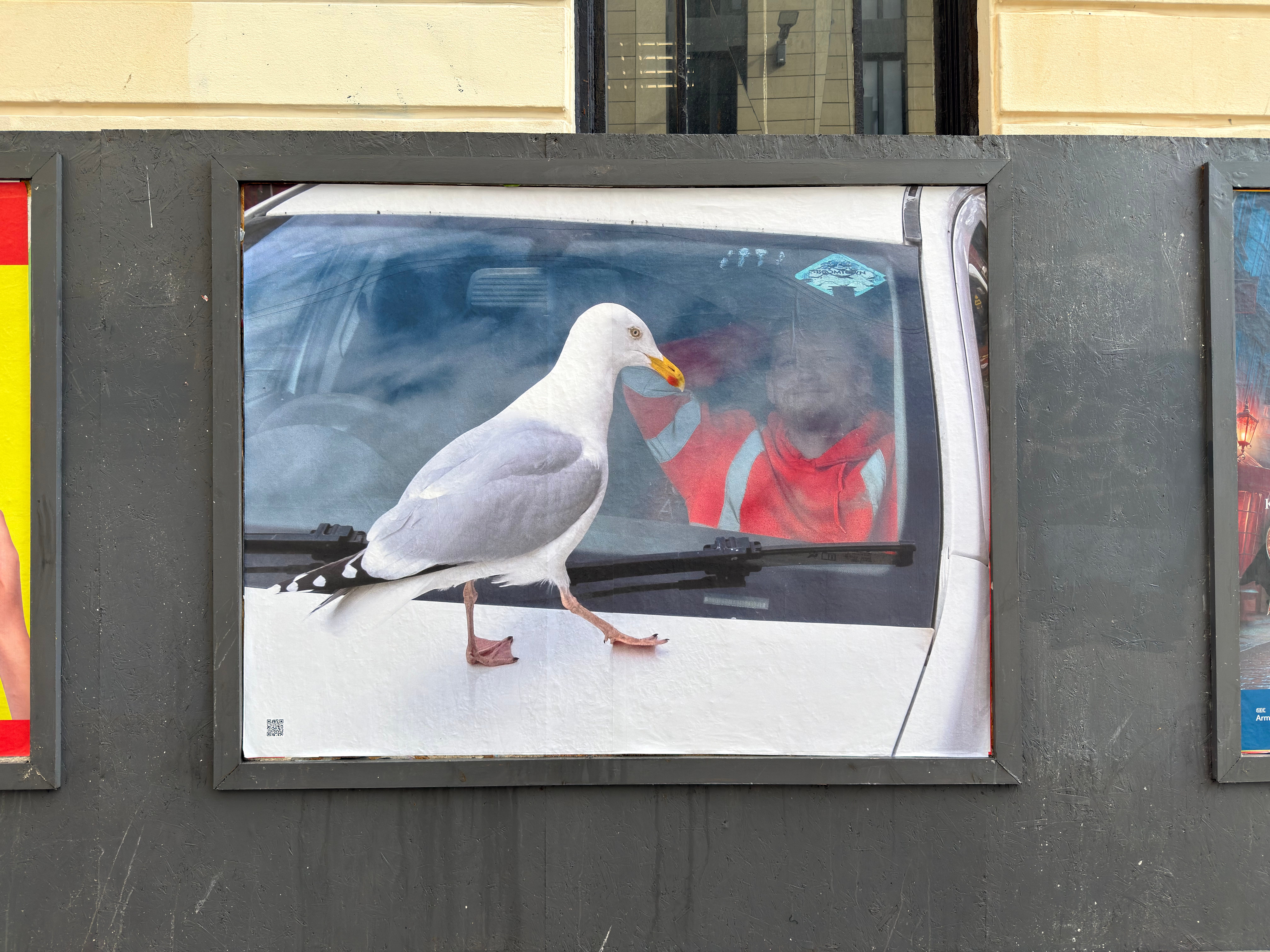
NS: What kind of feedback have you got about the project?
All: The feedback has been super positive, and the photos of the work in situ have added to the fun of the project. Even interactions from the public, like adding a sticker here and there, a bit of gum, graffiti, or a smush of mud, show that people are noticing the images as different from typical advertisements.
We owe a huge thanks to Creative Scotland for funding this round of the project and BUILDHOLLYWOOD for helping us make it bigger than we could have dreamed.
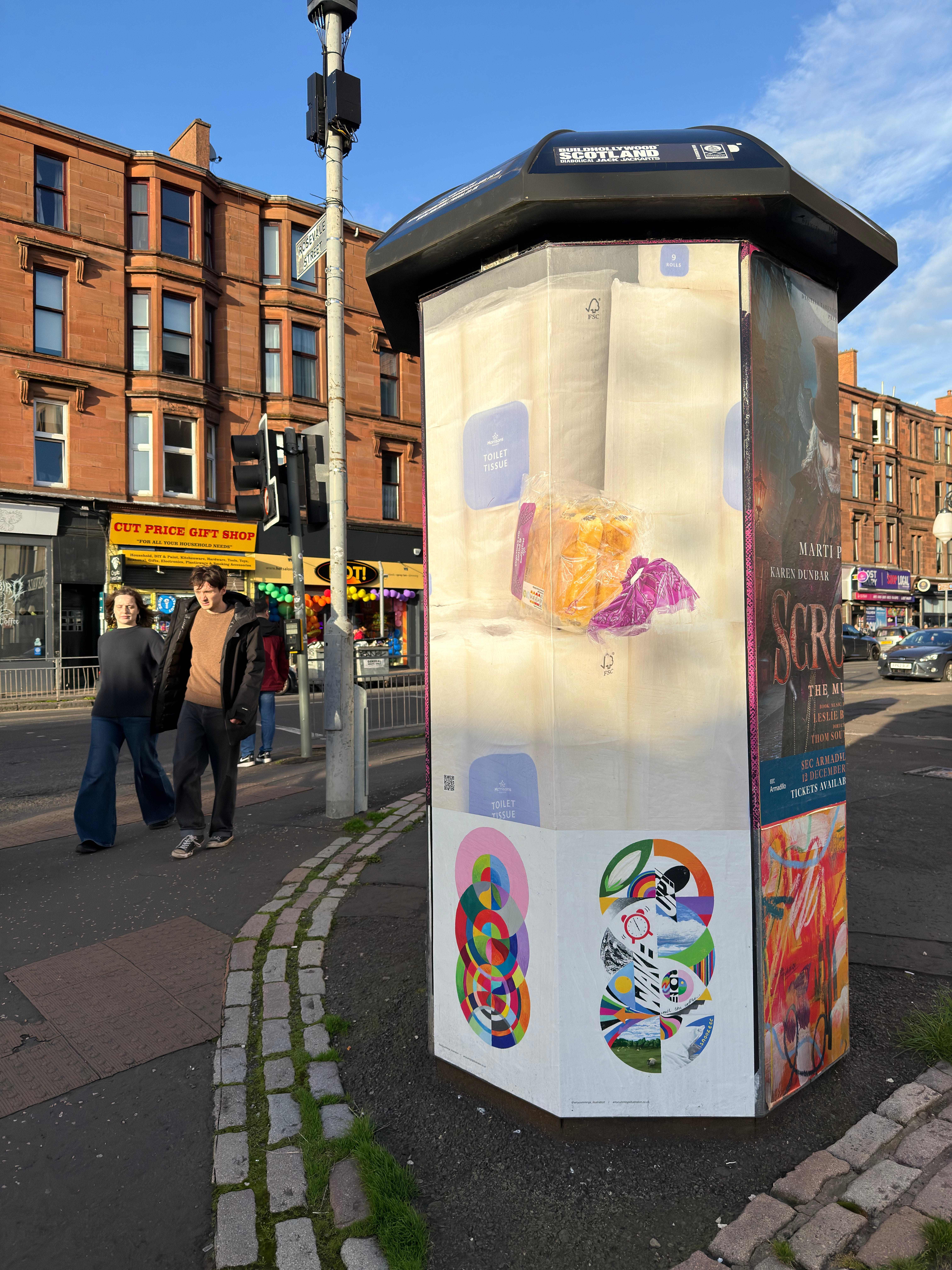
NS: Congratulations, Douglas, Sophie, and Sophia. I look forward to the next iteration.
The Urban Coincidence poster campaign runs from 14 to 27 September 2026. Check out the sites on this map.
Now that you’ve read this piece, here are some buttons you can click.
Looks like a cool project. I know I’d notice and enjoy these walking about.
A very interesting initiative, to my eye, Neil. I hope this spreads across the UK (if it hasn't already)